Year of 1000km
Enhancing the Usability of a Website for Sports Challenges and Healthy Lifestyle
Moderated Usability Testing
Gamification in UX
July 2021
Sole UX Researcher
Zoom, Excel, Mural, Adobe XD, Power Point, Calendly
Executive Summary
The Year of 1000km application leverages communities for inspiration and healthy competition via official and custom Challenges. Which stages of using the website for spots and healthy lifestyle challenges have delightful or disturbing experiences?

To view the entire User Journey Map, zoom in and out to every detail click on this link to access it on Mural.
Task Success Rate
The table below quantifies the participants’ experience with taking every step in all 5 stages using the website.

Context
About Year of 1000km
The problem of not being able to cross sport-specific boundaries in one app
While some fitness tracking apps can be helpful and fun for tracking progress, they fail to allow people to compete across multiple activities within their fitness community. A runner and a swimmer, for example, may have similar fitness and improvement goals, but it’s tough for a running or swimming app to quantify the two in a way that makes comparative sense. For too long, sports enthusiasts, personal trainers, and those who simply crave a social aspect of their health and wellness have struggled to find a place where they can come together online.
About testing the platform
Lee Haines founded the Year of 1000km to bridge the gaps in the fitness and wellbeing apps space. In 2021 he reached out with a request to test the beta website because he needed UX research-led recommendations for product development.
3 Health-related activities
Members can take part in 3 health-related activities:
Distance Challenge
(e.g., running, walking, cycling, swimming)
Healthy Lifestyle Challenge
(e.g., yoga, exercise, sports, calorie counting, weightlifting)
Healthy Mind Challenge
(e.g., meditating, playing instruments, and cognitive activities)
Activities are converted into rKM—running equivalent kilometers. The goal is to complete the equivalent of 1000km within a calendar year. Besides the point system in the form of rKM and health-related challenges, other gamification elements included a leaderboard (aka benchmarking) and a feedback system under progress.
Objectives
The current research evaluates 5 scenarios that are formulated with the Jobs-To-Be-Done framework. This approach allows defining the specific tasks people should be able to accomplish in relation to their motivation and desired outcome.

Methods
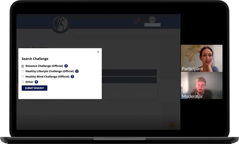
To fulfill the project objectives usability testing was conducted with 5 B2C current users who performed 5 activities with the live website for the duration of 30 minutes over Zoom. The solo founder invited sports enthusiasts and busy individuals who craved the social aspect of their health and wellness to participate.
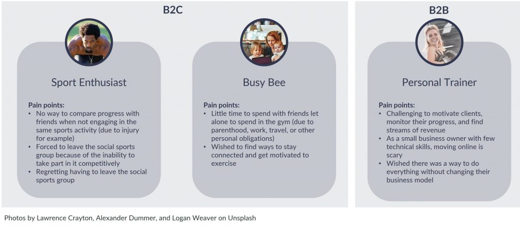
The following high-level questions were addressed:
Expectations
Do the functionalities work as expected?
Understanding
Are all functionalities clear and understandable?
Behavior
Where do people look and click, and which elements are used/not used? Where do they struggle?
Experience
How do people experience and enjoy the website?
Process
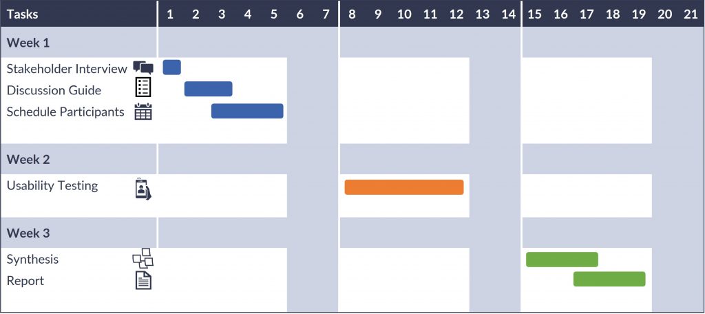
The Gantt chart below summarizes all research activities carried out over the course of 3 weeks. Conducting and recording the interviews were done via Zoom, participants were scheduled with Calendly, findings were synthesized in Excel, and the report was drafted in Google Docs and shared via Google Slides.
Key Findings
1. No one used the avatar
All participants were able to contact the admin of the website via the contact link in the footer, but no one discovered that the cartoon avatar on the bottom left served the same purpose.
Recommendation:
- Some explanatory text next to the avatar or simply swapping the image with the text “Contact”, might help users recognize that they can use this widget to contact the admin and give ratings.
2. Experience with Microsoft Explorer is disastrous
The website did not run properly on Explorer. One participant could not log in and join a challenge even after resetting her password. Neither could she enter progress. Most of the UI was unclickable and out of proportion. Eventually, the participant switched to Firefox and managed to complete the test.

Recommendation:
- Notifying website visitors that support for certain browsers is not provided and directing them to those which provide the best experience might cater to a higher user retention rate.
3. Why do I need to log in/sign in?
Some participants expect to see a prompt or information that logging in is required to join and create a challenge.
Participant 5“At this point, I don’t know what I’m doing. There is no instruction.”

Recommendation:
- Participants need to be informed about what is going on through appropriate feedback. Following an appropriate onboarding, a simple chart with steps might help participants easily understand where they are in their journey.
4. Which challenge do I assign my progress to?
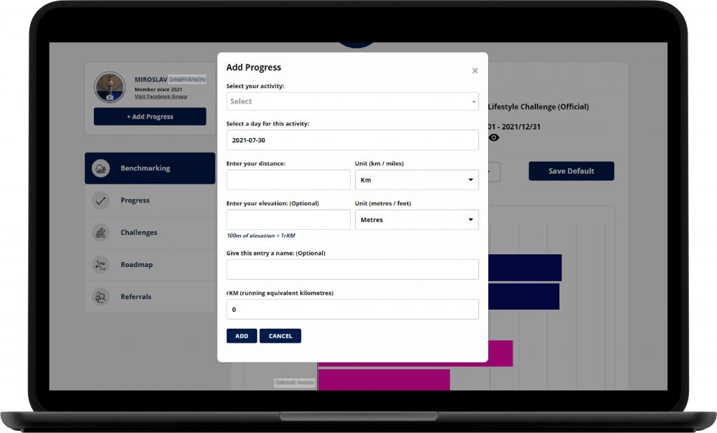
Most participants were unsure which challenge they were assigning their process to when they selected ‘add progress’.
Participant 4“I will try to add progress […] I am unclear when I add progress which challenge it will enter into.”
Recommendation:
- Adding an additional drop-down like in the benchmarking section might help people recognize which challenge they are assigning their progress to.

5. Bell notification is unclear when a request is submitted

Participant 1“It says wait for the moderator to accept, but I don’t know if he has already done it…I’d like to see another tab “request pending” or “waiting for approval”. Something that tells me I’ve done it properly and that it now needs to be processed.”
Recommendation:
- Creating a separate column under “Join Challenge Request” with request status next to the Action column might help participants understand that they took the correct step to join a challenge (visibility of system status heuristic).
6. Expectation to click on a tile to access a challenge

Once participants have joined or created multiple challenges, they expect to be able to click on a tile to access a particular challenge and add progress.
Recommendation:
- The ability to click directly on the UI box would aid access to one’s challenges.
7. The progress bar color scheme is unclear
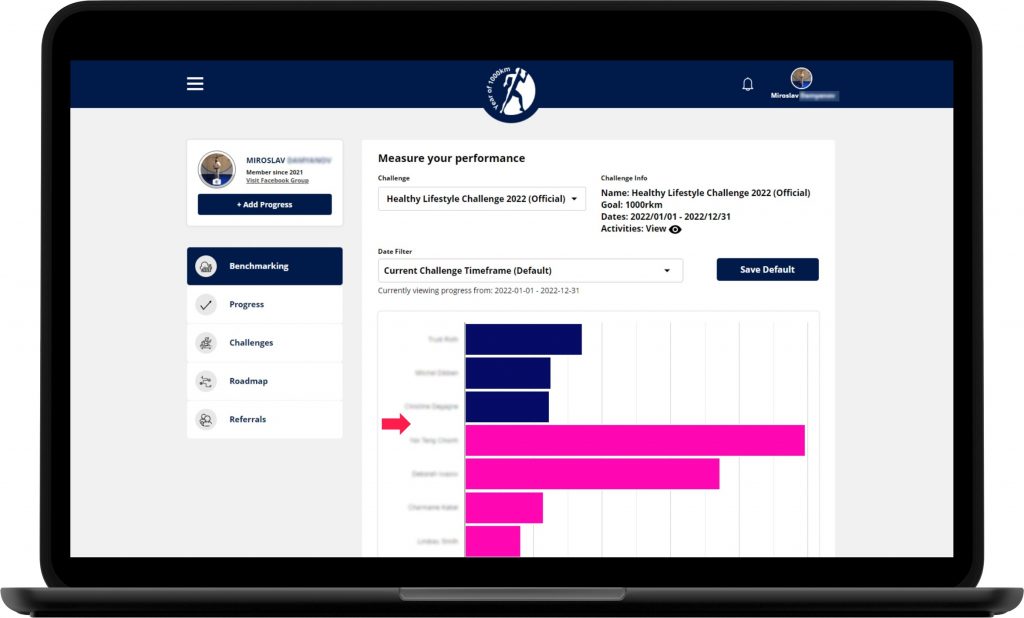
The majority of participants were unable to understand the color codes under benchmarking. Only one of them had prior knowledge about the meaning of the colors because she had talked to the creator of the platform before.
Recommendation:
- Showing a color scheme legend on the benchmarking page might ease the cognitive load and help people recognize where they are at in their standing compared to other community members.
8. Is it only about running?
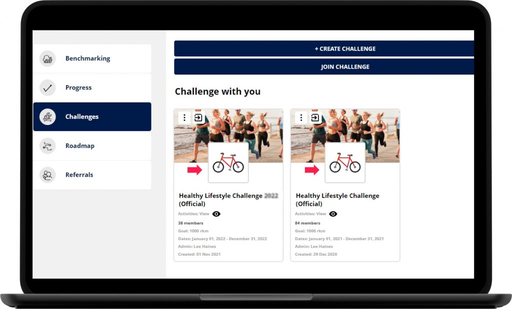
Participant 5“Nothing stands out about swimming. It’s all about running.”
Some participants were confused if they could join a sports challenge for swimmers because the header image includes only runners even though some text was capitalized in the description. Participants were looking for more visual cues.
Recommendation:
- Using a photo collage upfront on the website coupled with specific icons for each of the three health-related challenges under the “Challenges” page might help people understand that they can participate in various activities at a glance.
9. About being recognized in the community
Participant 5“I do believe that he [admin] needs to start giving people an award medal to people completing yearof1000km. If I ran 1000 km in a year I want a physical medal. I get a medal for running 5 km in a day. Why don’t I get a medal for running 1000 km in a year? I will pay for it. Some people want it, some people don’t. This is aimed at people who are never gonna sign up for a 10 km run or triathlon [in real life]. But these people went to the gym for a whole year! ”
Some mentioned being motivated by joining a bigger group of people across multiple activities. One participant even mentioned that he would be very encouraged if he received a physical medal via the mail as a recognition of his consistent efforts.
Recommendations:
- For some who are not top athletes receiving a token of appreciation might be very encouraging. Think about displaying achievement badges on the user profiles and even sending members a physical medal.
- Think about social features that will allow participants to keep each other motivated and accountable in relation to their healthy lifestyle goals.
- Some participants would appreciate sharing their milestones with a wider audience on the platform or social media. Think about CTA on the benchmarking page which members can use to share their progress updates with the group.
Key Takeaways
Highlighting the healthy lifestyle, not so much the running aspect, reflects better the value proposition of the platform.
Embracing a healthy lifestyle identity is stimulated when a member feels connected to and recognized by a wider group.
Tweaking the sign-up process, benchmark page, and comparing progress are the minimum usability requirement for retention.
Impact
