Enhancing a Mental Health App during the COVID-19 Pandemic
Unsolicited end-to-end UX project
April – August 2020
Sole UX Researcher
Zoom, Excel, Adobe XD, Google Forms, Power Point
Problem
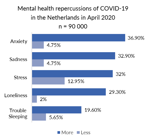
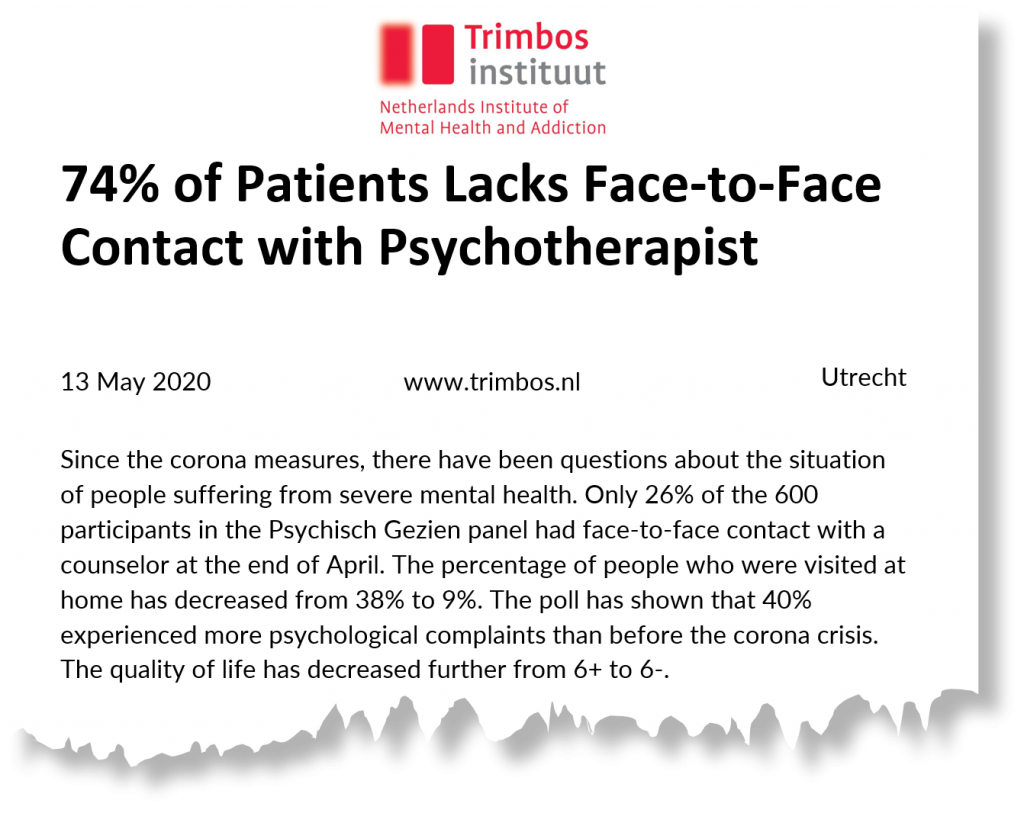
The COVID-19 pandemic changed life as we knew it over night. Think about the culmination of job loss, isolating conditions of a lockdown, or potentially losing loved ones. Besides, the pandemic affects mental health and limits the access to on-site psychotherapy. In the Netherlands, for example, face-to-face psychotherapy visits for people with severe mental illness dropped to 26% in April. Without timely support, even the mild cases will exacerbate.
How to ensure widespread availability of mental health support in this unprecedented time?
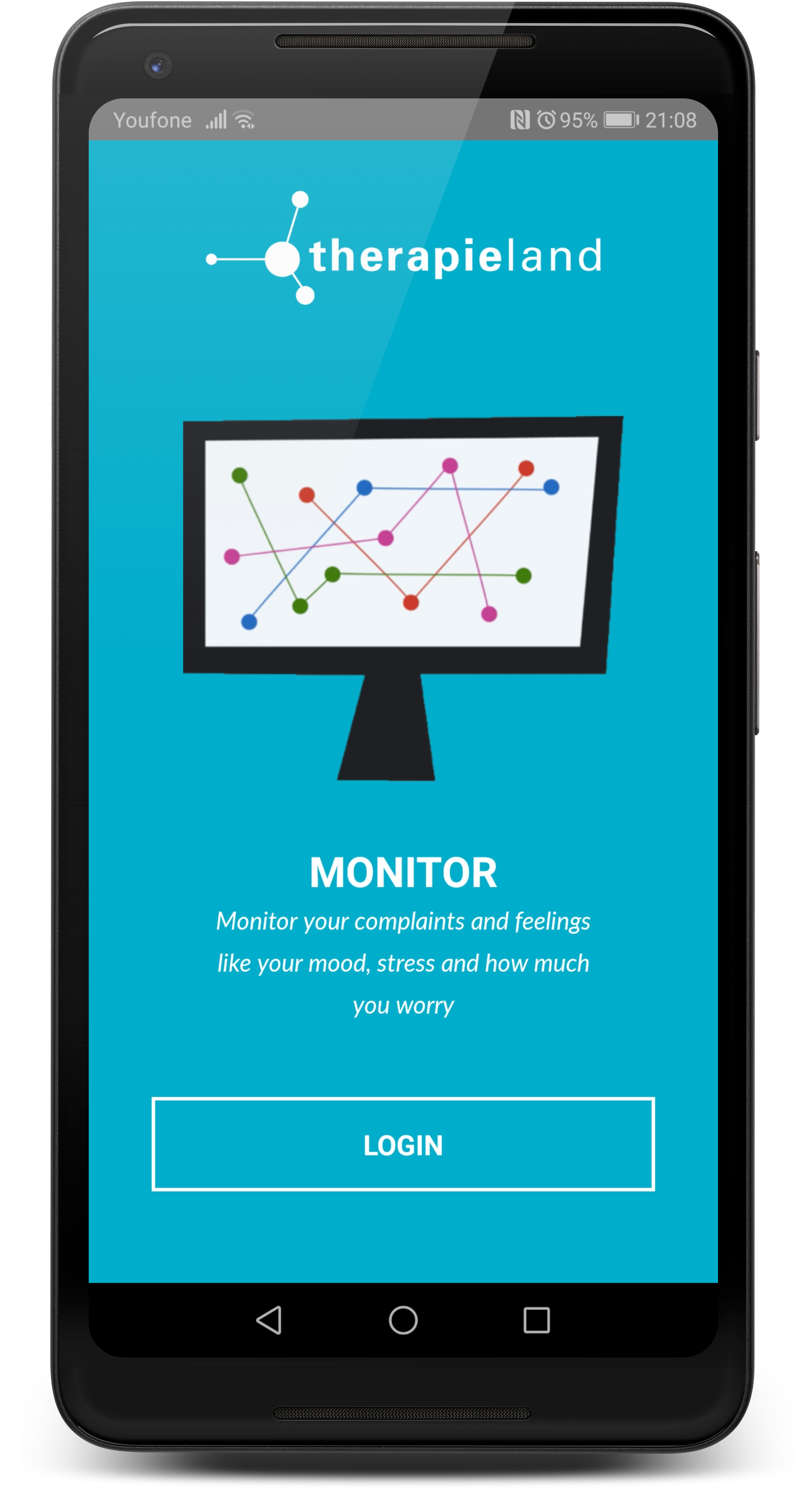
Until a cure or a vaccine against COVID-19 is invented, mental health apps might fulfill the existing treatment gap by reaching people with limited or no access to professional mental health services. In 2019 Therapieland, one of the leading e-mental health providers in the Netherlands, released a mobile application under the name Therapieland Monitor. With it people can track their sleep, stress, and mood as well as follow a few relaxation exercises.
How does Therapieland Monitor perform in the context of e-mental health landscape and COVID-19 pandemic? How do novices experience it?
Objectives
The objectives of this research are to explore design features and identify usability issues as needed to optimize Therapieland Monitor during the COVID-19 pandemic.
Research Questions
Exploratory Research
The goal is to explore the problems space, compare competitors’ products and discover design features.
- What are the associated effects of COVID-19 pandemic to mental health?
- What mental changes do residents in the Netherlands report?
- What coping strategies do people have in response to COVID-19 and mental health?
- What design features are common on the market for mental health apps?
- To what extent do people use technologies for mental health issues?
Evaluative Research
The goal is to test an existing design solution and assess its usability in relation to people’s needs, behaviors, and attitudes. I aim to develop deeper understanding of the users and identify areas for improvement.
- Can people identify the most important functions and features? (findability)
- To what extent are features clear and understandable for use? (understanding)
- Do the features work as expected? (expectation)
- Where do users struggle? (difficulty)
- Where do people click; which elements are used/ not used? (behavior)
- What design features would people like to be integrated in the app? (opportunities)
- How do people generally experience (and enjoy) the app? (experience)
Methods
- Desk Research
- Survey
- Competitor Analysis
- Heuristic Evaluation
- Usability Testing
- Empathy Map
- Rainbow Spreadsheets
- Usability Attitudes Scale
- Personas
Exploratory Research
Survey
With no access to user data, I decided to firstly administer this online survey with Google Forms to explore the problem space and recruit participants for remote usability testing.
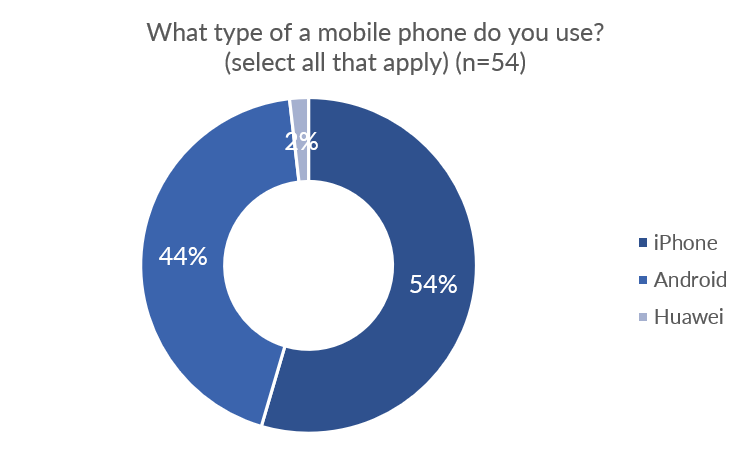
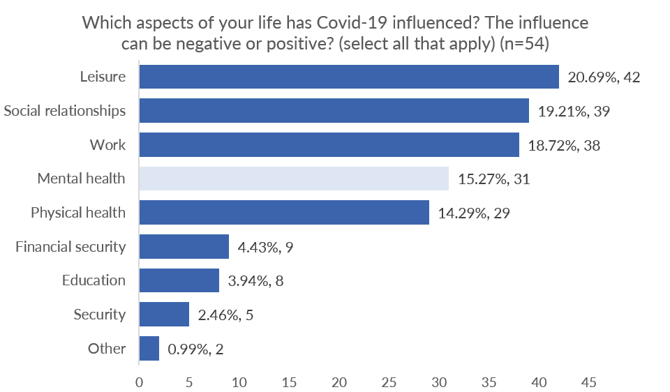
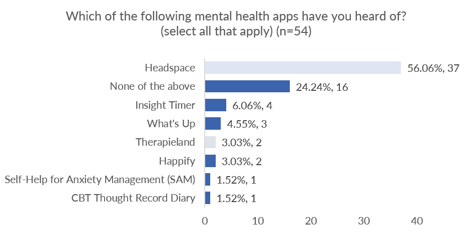
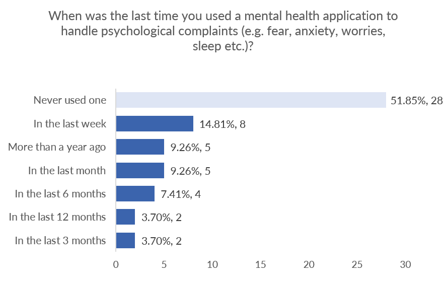
Mental health was listed as the fourth aspect of life which was affected by COVID-19. Participants were familiar with Headspace, but only 2 had previously heard of Therapieland Monitor. Slightly more than half of all participants had never used a mental health app to treat psychological complaints while the rest had used mental health apps at some point in the last year.
Competitor Analysis
The purpose of this analysis was to understand what the marketspace for mental health apps looked like. Common design features are outlined and categorized in terms of psychological symptoms and interventions. This table below is an overview of how Therapieland Monitor performs in relation to other competitors.
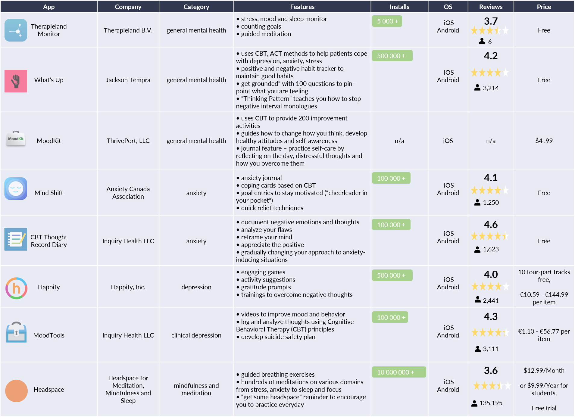
Like other tools, Therapieland Monitor taps on the benefits of self-tracking, goal setting and meditation to encourage symptoms recognition, behavior change, and self-reflexivity. Despite this similarity with other competitors, this general mental health app does not enjoy huge engagement.
Heuristic Evaluation
I performed thorough analysis of Therapieland Monitor’s interface according to Nielsen Norman Group standard principles to detect usability issues that may occur when participants interact with the mobile app. I also provided ways to resolve the detected issues. The importance of this step was to help me focus on features and devise tasks for usability testing afterwards.
Although the mobile app has a straightforward and minimalist design, which helps me to quickly identify the 3 main features, it has a number of serious problems. Below I outlined the top 3 issues, which should be given a major priority.
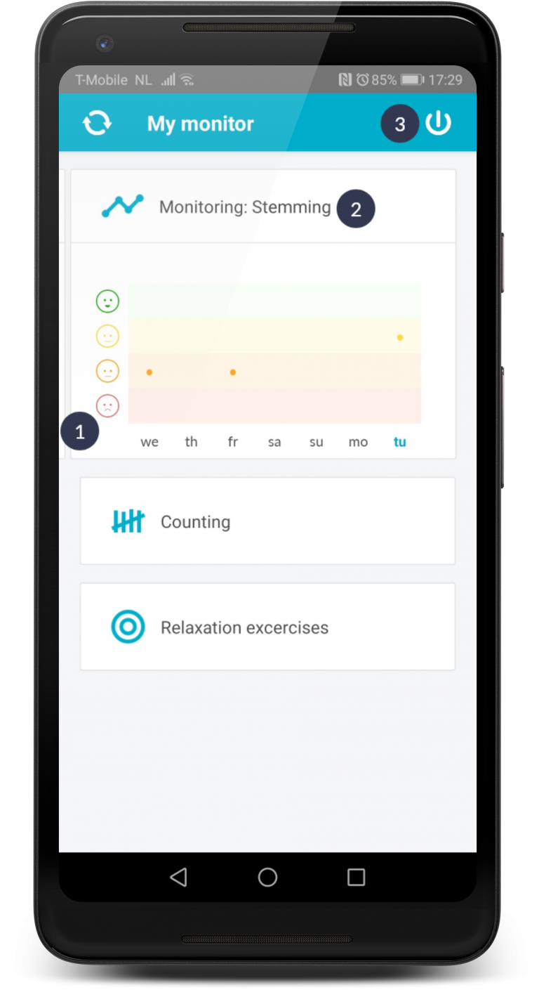
Navigation between stress, mood, and sleep monitor requires recall because no popup instructions are available anymore. Edges of the next following card are too small and unnoticeable. Recognition rather than recall principle is violated.
English and Dutch are used simultaneously. This is not consistent. For example, ‘stemming’ is used instead of mood.
It is odd that the logout button is so prominent on top right of screen and nothing warns you for accidental hits. Confusion occurs because the refresh button, which has resembling oval shape, is placed in the opposite top left corner.
Usability Testing

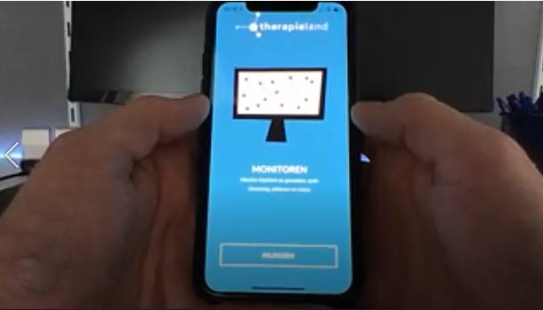
I conducted this remote usability testing with 6 volunteers between the age of 18 and 34 to understand how novices would use Therapieland Monitor. By observing how people used the app, I could identify several usability issues and areas of improvements, which the developers might have missed.
My challenge was to find a cheap way, which was also not obtrusive for participants. I implemented the so called “hug the laptop” procedure. Participants did not have to install any software on their smartphones or laptops. I asked them to think out loud while doing the assigned tasks, so I could record their open opinions and reactions.
Key Findings and Recommendations
All participants could identify the main features via a central dashboard. Design is basic, unobtrusive and clean. Headings are straightforward and self-explanatory.
However, participants experienced a number of issues among which the top 3 serious ones from the heuristic evaluation.
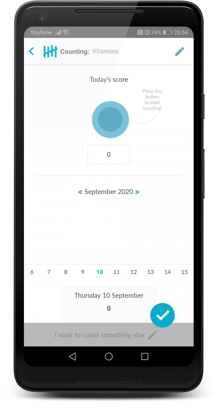
5 issues were observed with 3 out of 6 participants trying to use the counting feature. Those range from struggling how to find counting one more item, confusion about the time frame a count is valid to annoyance that the input doesn’t immediately appear on the graph before participants confirm their change.
Participant“Just the turving [counting] was a little bit of a thing because I couldn’t immediately get what I should do first. Should I press the button or should I type a number. In the beginning it is not straightforward in how to keep track. Is it only for that moment? Is it for the entire day or do I have to start a new monitor for the next day?"
3 out of 5 participants experienced errors with the app. When participants close the app by accident, they try to re-open it. However, they see a white screen or a message “No Internet connection” regardless of the fact they actually have a Wi-Fi connection. They were puzzled and annoyed.
Recommendation:
Inspect back-end and ensure quality control
Participant“It says, there is no internet, but there is!”
Detailed Findings and Recommendations
Rainbow Spreadsheet
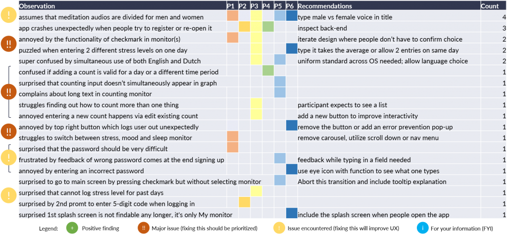
This method helped me grasp behavioral patterns of how participants used the app during the usability testing. This spreadsheet gives a focused overview of the frequency and severity of issues encountered. It also draws attention to issues with particular features. I can quickly share findings with a list of recommendations at a glance.
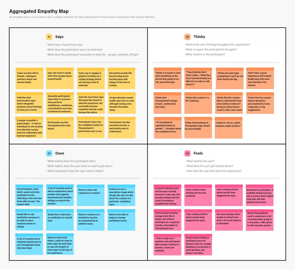
Aggregated Empathy Map
I created this empathy map to gain a deeper understanding for participants’ profile, thoughts, behaviors and feelings. By stepping into the shoes of others, I attempted to show areas that require attention. Because participants belong to the segment of novice Therapieland app users, who are highly educated young professions, I organized findings of all participants into one diagram.
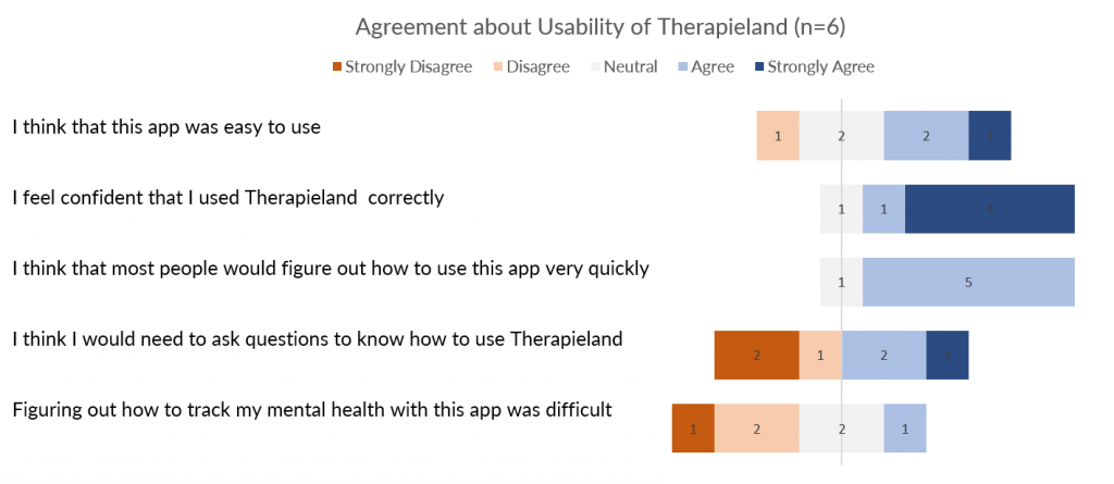
Gauging Attitudes towards Using Therapieland Monitor
After participants interacted with Therapieland Monitor, I immediately administered a questionnaire to gain understanding about the attitudes they have regarding the usability of the mobile app.
Personas
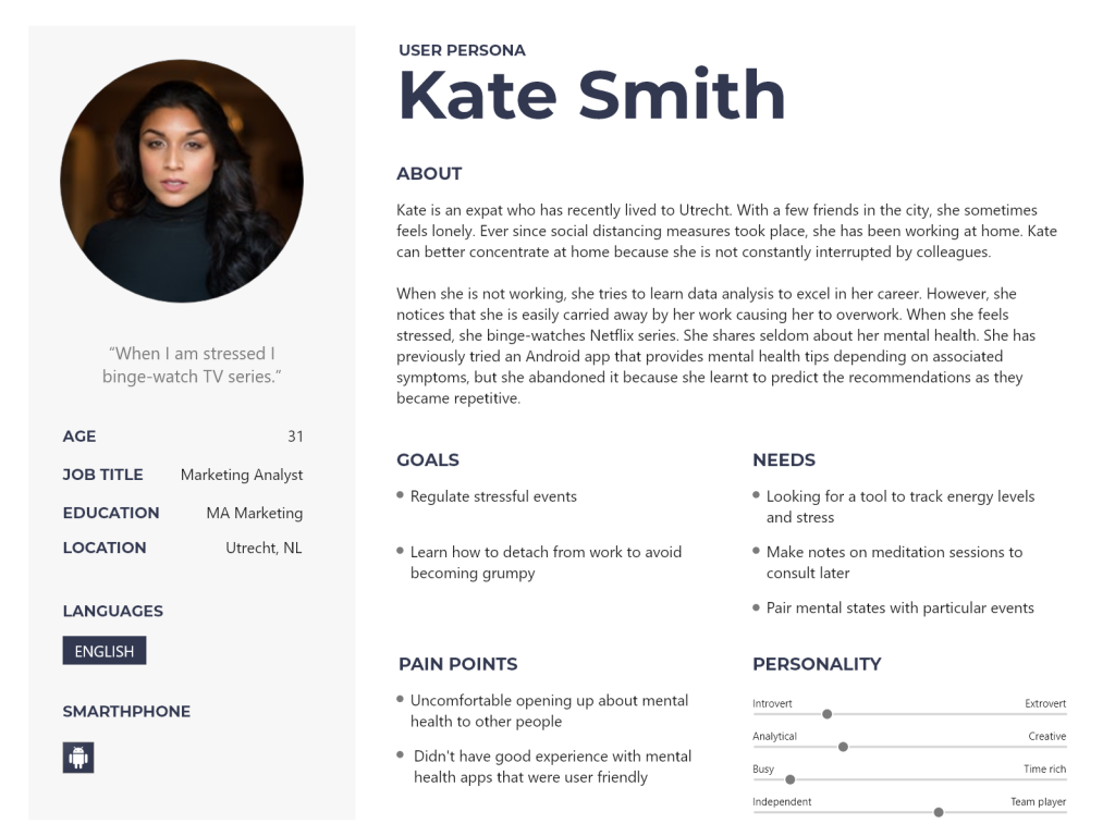
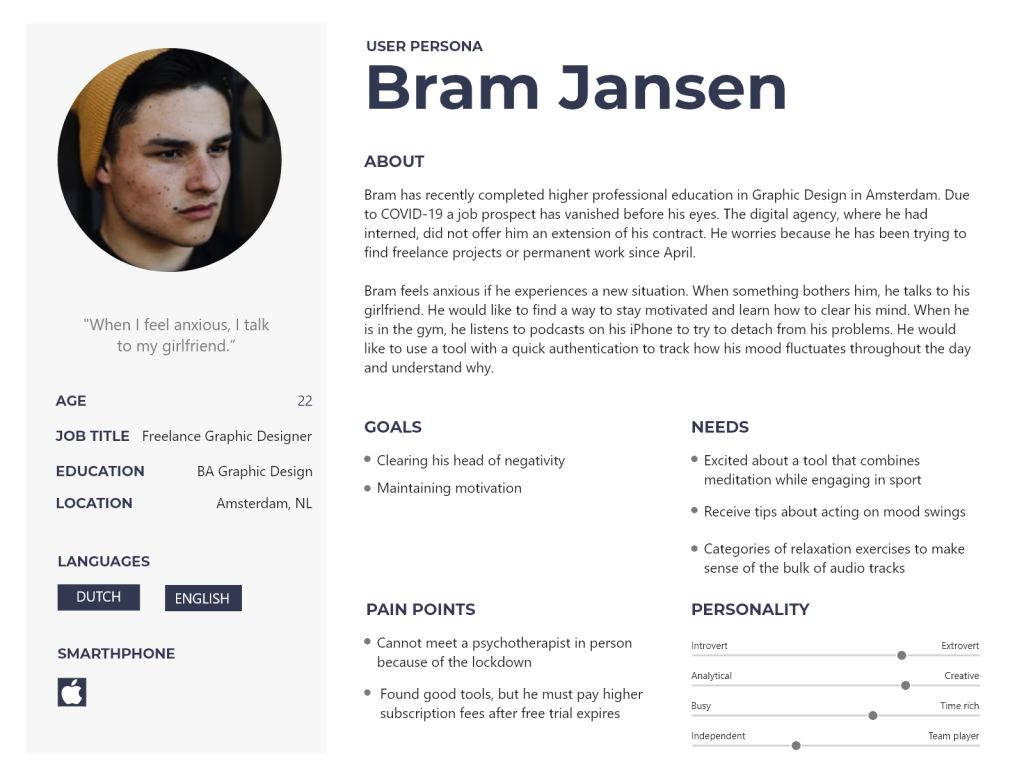
To help me identify with users of a mental health app, I created two user personas. These personas are two fictional characters which might use Therapieland Monitor. The purpose of these personas is to create a more reliable and realistic representation of the key audience. These representations are based on desk research, a survey with 54 people and remote interviews with 6 participants. This is a quick and inexpensive way to prioritize features and focus on major goals, needs and problems.
Study Limitations
- Because this is an unsolicited project the constraints of the company are unknown and therefore their design choices too.
- Results are obtained from a convenience sample recruited via social media platforms and results may, therefore, not represent the general public.
- No analytics package was used to automatically record time spent on each task. A more reliable measure of time to complete tasks would improve the analysis. This research utilizes the total time taken to complete all tasks with a trigger moment turning the laptop.
- Administering System Usability Scale (SUS) would give a better benchmark for attitudes toward the whole system.
Personal Reflections
- Mental health resonates with my personal experience of following an in-person psychological support for half a year. When COVID-19 outbroke and on-site visits were canceled, I suggested to the therapist to accommodate video conferencing, so I could successfully complete the treatment plan in due time. I also tried to utilize meditation and monitoring desktop and mobile apps like Therapieland.
- Like some of my participants I was left without job during the lock down, so I decided to utilize my free time to explore mental health in relation to digital support tools by conducting user experience research.
- Throughout my conversations with participants and friends, I realized that mental health issues are generally encountered, especially in this turbulent time. Seeing more people opening about their health is encouraging because self-care is important. The more this issue is present in the public discourse, the less it will be perceived as a taboo.
- I am now keen on following developments in digital tools aiding mental health.
You can also download a detailed report in pdf for FREE.
